
Saldora: a fintech landing site that's fast, found on Google and sharp on every screen
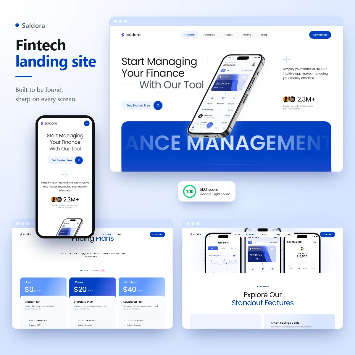
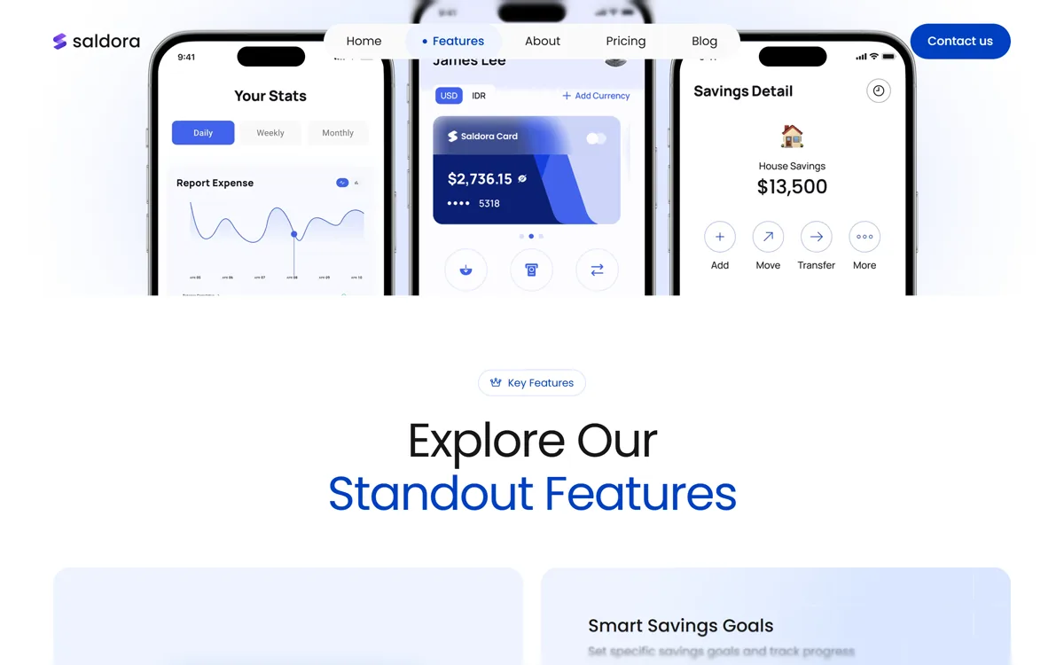
Saldora is a personal finance app from a startup in Australia, and it needed its marketing site: the page people land on from Google, read on their phone and decide whether to download. I took a finished design and turned it into a production Next.js site, live within the first week of a two week build. 46 pages, matched to the design on phones, tablets and laptops, with the smooth scroll animations of a premium app, and every page set up so search engines understand it. Google's Lighthouse gives it a perfect 100 for SEO.
Personal finance app startup (Australia)
Front-end engineer, sole builder
2 weeks, live in week 1
Next.js 16, React 19, TypeScript, Tailwind CSS v4, shadcn/ui, Motion, Lenis, Vercel
Open it on your phone too. The phone layout is built on its own, not just shrunk down.
First, a quick honest note
The user numbers, reviews and team on the site are placeholder content for now. What you're looking at is the real work: the site itself, the way it's built, how it behaves on every screen and how well search engines read it. That's exactly the part I'd build for your product.
The problem
For an app, the landing site is the shop window. Most visitors arrive from a Google search on their phone, decide in a few seconds, and leave if the page is slow, jumps around while loading, or looks broken at their screen size. A beautiful design only pays off if it survives that.
The brief: take a finished design for a finance app's site and ship it as real code. It had to match the design on every screen size, keep all of its animation, load fast, and be set up so Google can find and understand every page. And it had to be easy to change later, without a page builder or a monthly CMS bill.
What I built
-
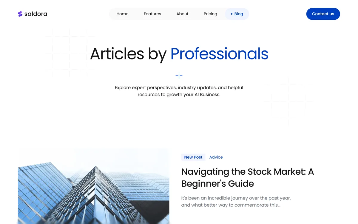
A complete marketing site, 46 pages. Home, features, pricing with a monthly and yearly switch and a plan comparison table, about with the team and open jobs, a blog with 10 articles, integrations, a changelog, download, contact and the legal pages. One set of colors, type and components runs through all of it.
-
Matched to the design on every screen. Phones, tablets and laptops each have their own layout, and each one was checked side by side against the design until spacing and type lined up.
-
Motion that feels like a premium app. A short intro on first load, sections that glide in as you scroll, phones that drift with parallax, stacked cards that pin as you pass them, scrolling tickers, letters that roll on hover and smooth scrolling.
-
Set up for Google from day one. Every page has its own title, description and canonical address. There's a sitemap, a robots file, structured data that describes the company, the app with its three plans and every article, and a proper preview card when a link is shared.
-
Content you can change without touching the design. Prices, articles, jobs, team members and integrations live in 14 typed content files. Change a price or add an article there, and every page that shows it updates.
How it works
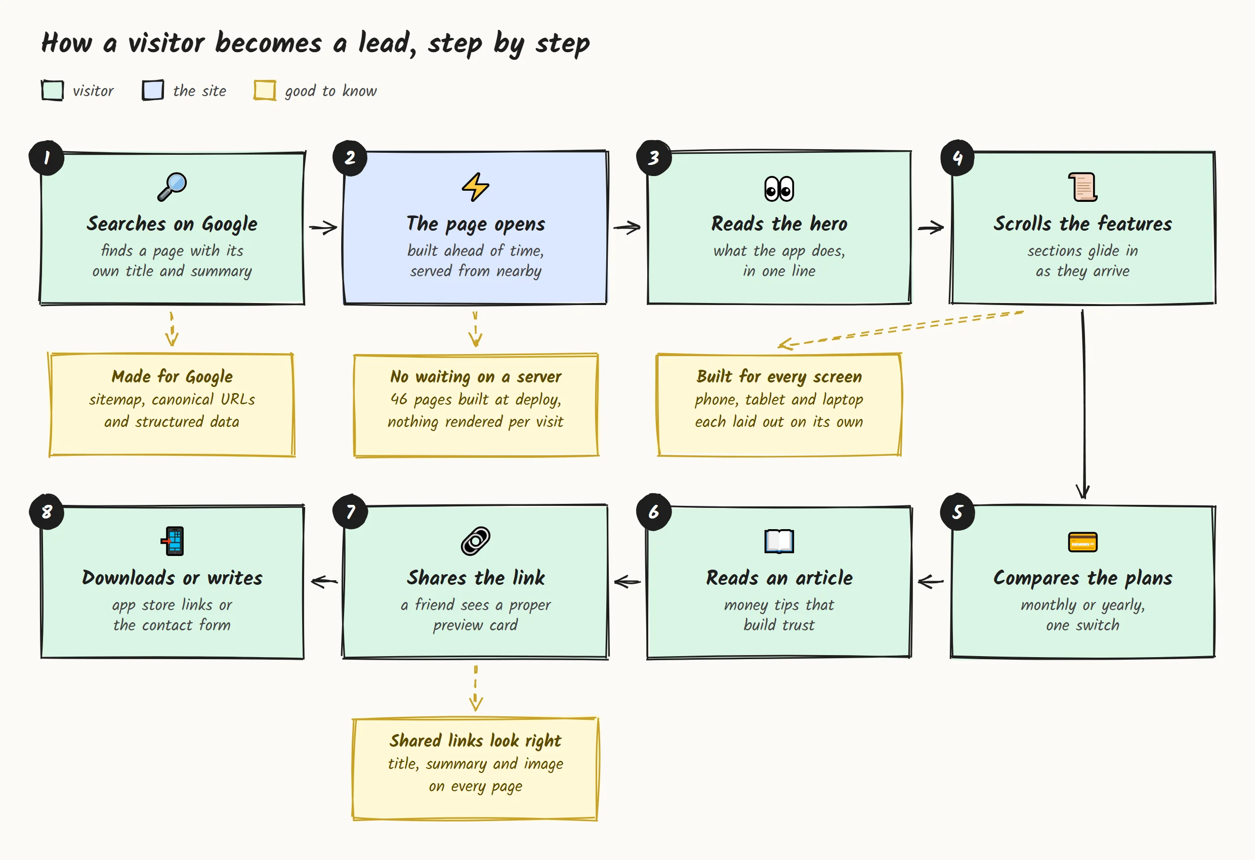
Here's the path a visitor takes, from a Google search to downloading the app or getting in touch. The notes show what the site does behind each step.
The stack
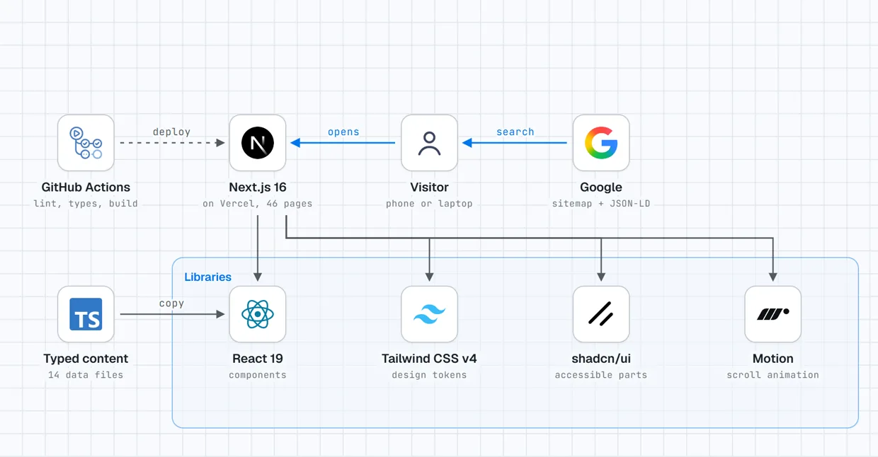
Every page is built once, when the site is deployed, and served as a ready made file from Vercel's network. There's no server working out a page while the visitor waits, and nothing to keep running or patch. GitHub Actions checks every change before it goes out.
The hard parts, and how I solved them
A landing page looks simple in a screenshot. Making it match a design at every size, move smoothly and still rank is where the work is.
-
Matching the design at three sizes, not one. Designs are usually perfect at one width and guesswork at the others. I captured the design at phone, tablet and laptop width, set colors, type and spacing as shared tokens, then compared every section screenshot to screenshot at each size and fixed what didn't line up.
-
Rich animation without a jumpy page. Lots of motion usually means content that shifts while it loads, which annoys visitors and costs ranking. Every image and section keeps its space from the first paint, and the fonts are served from the site itself and loaded early. Lighthouse measures the layout shift at almost zero.
-
Google sees what people see. The first version had the same title and description on every page and no sitemap, so Google would have seen 46 copies of one page. Now each page describes itself, and the structured data is built from the same files as the page, so the prices Google reads are always the prices on the page.
-
Easy to edit, without a CMS bill. A small marketing team doesn't need a paid CMS on day one. All the copy lives in typed files, so a missing price or a misspelled field stops the build instead of breaking the live page, and an address that doesn't exist shows the 404 page instead of an empty one.
How I write the code
-
One component per section. 72 small components on top of shared tokens and parts, so a new page is mostly putting existing sections together.
-
Checked on every push. GitHub Actions runs the linter, the TypeScript check and a full build before anything can go live.
-
Not locked to one host. It runs on Vercel today, and the same code also ships as a Docker image, so it can move to your own server if you ever want to.
-
Clean history. Small commits, each describing one change, with strict TypeScript across the project.
Found on Google, and usable by everyone
Measured with Google's own Lighthouse on the home page.
-
A perfect 100 for SEO, accessibility and best practices. On a phone and on a laptop, so nothing on the technical side holds the site back in search or shuts anyone out.
-
Built for screen readers too. Ratings and plan ticks carry a proper label, so a screen reader says "5 out of 5 stars" instead of skipping them.
Delivery
Two weeks from start to finish. The full site was live by the end of the first week, so the client could share a real link right away. The second week went into polish: search engine setup, accessibility, and checking every page on phones, tablets and laptops.
The site is live on Vercel, and every push to the main branch deploys it after the checks pass. The contact and newsletter forms already check what people type and show a thank you state, ready to be connected to your inbox or CRM.
You'd get the repo, the content files, the design tokens and a live site you can send to investors and early users the same week.
What you get when you work with me
-
Your design, live in days. Send me the Figma file or the site you like, and get a real, fast site back, not a mockup.
-
Right on every screen. Phone, tablet and laptop each checked against the design, not just the one in the pitch deck.
-
Ready for search on launch day. Titles, descriptions, sitemap, structured data and share cards are part of the build, not a later project.
-
Code you own. No page builder subscription, no lock in. Your repo, your host, your call.
What the client got in 2 weeks
1 week
From a finished design to a live site
100
Google's SEO score, on phones and laptops
46
Pages live, each matched on phone, tablet and laptop
Years of
Experience
Projects
Delivered
Features
In Production
Community
Members
Get in touch
Have a product to build, or a workflow that eats your team's time? Tell me about it.I'll build a small working piece of it first, free, so you can judge the result before you commit.